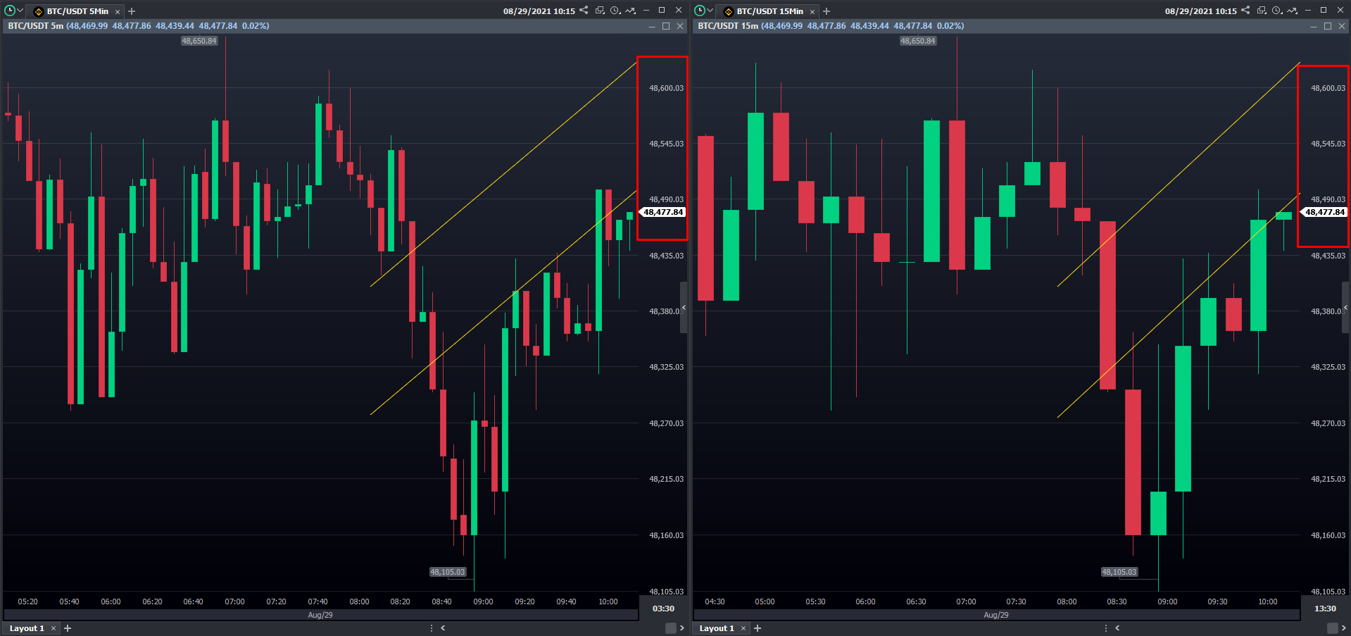
While adding studies to the chart, and then changing its time frame, it is common to identify some divergences when it comes to plot studies and indicators. This happens especially when we compare Temporal and Timeless charts.
Why does this keep on happening to my charts?
Because each study is added to the chart according to the position parameters, which are composed of date, time, and/or price (these vary between studies).
When you change the time frame, data positions might change, becoming more or less spaced between themselves. Another variable to be considered is the number of candles a specific interval forms, making the studies that connect the same points assume different angles and dimensions.
Is it wrong, isn't it?
No, it is not. The platform considers the mathematical position of the studies in the chart, recalculating them automatically.
Check below a couple of examples, comparing two charts in different time frames. Even though the studies are plotted at the same price levels (highlighted in red), their positions are completely different:

When the time frame is changed, the number of candles will change as well, and the position recalculated.
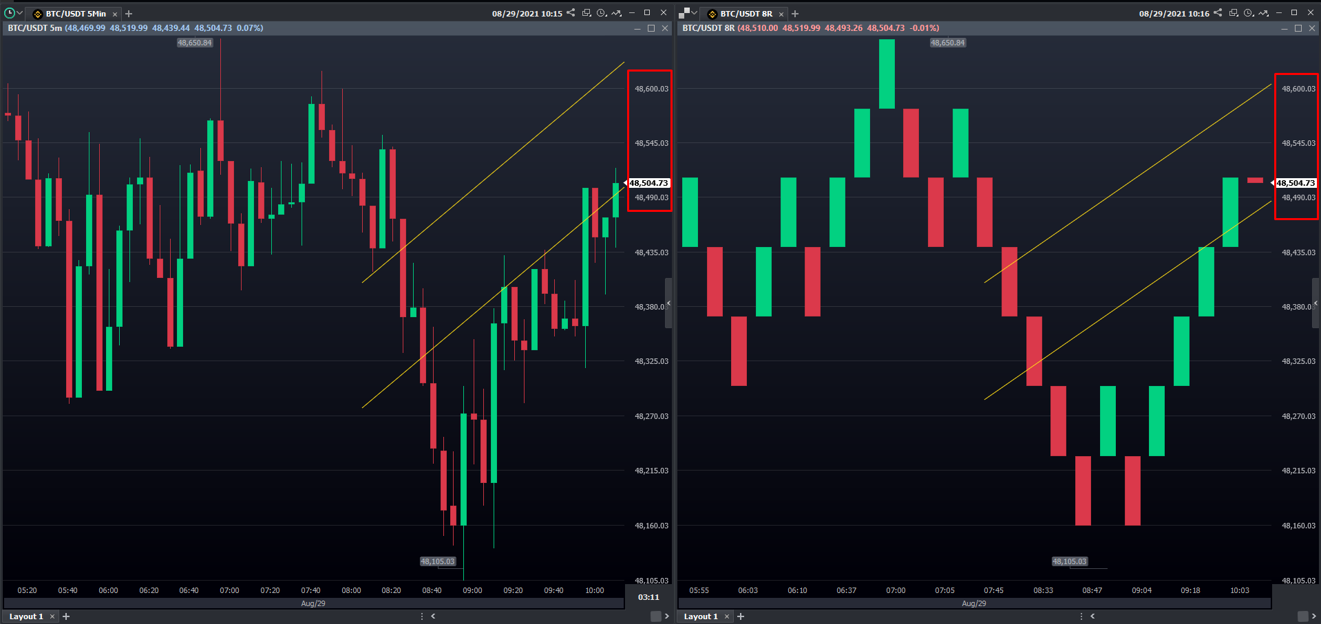
Second example: The same happens with the comparison between Temporal and Timeless charts:

Above, It is possible to identify an expected behavior. As mentioned previously, although the studies are plotted at the same point in the chart, the candles’ position will change according to the time frame used.
Hey! Was this content helpful?
Please rate it below! It's important that we work together to make our Help Center even more complete.
Happy trading!